Scaling Startups with Webflow
Scalable, conversion-focused Webflow websites tailored for tech startups
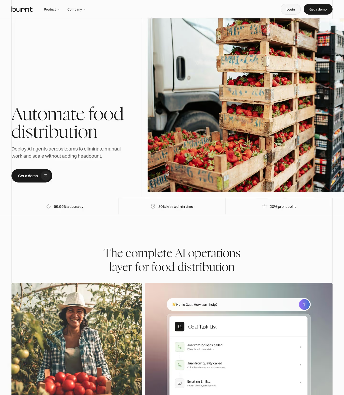
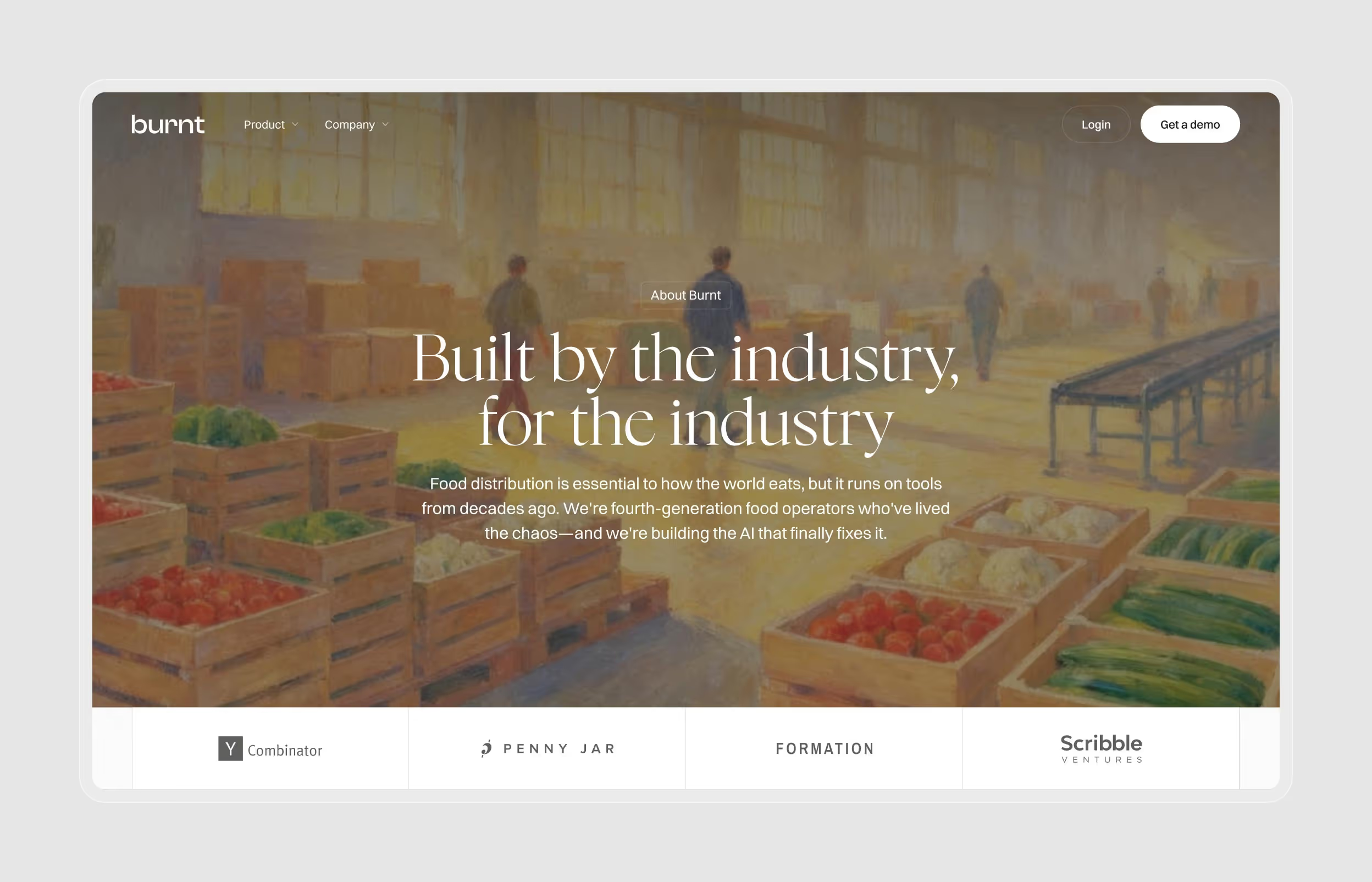
Burnt
Showcasing future platform vision and founder expertise to accelerate enterprise sales
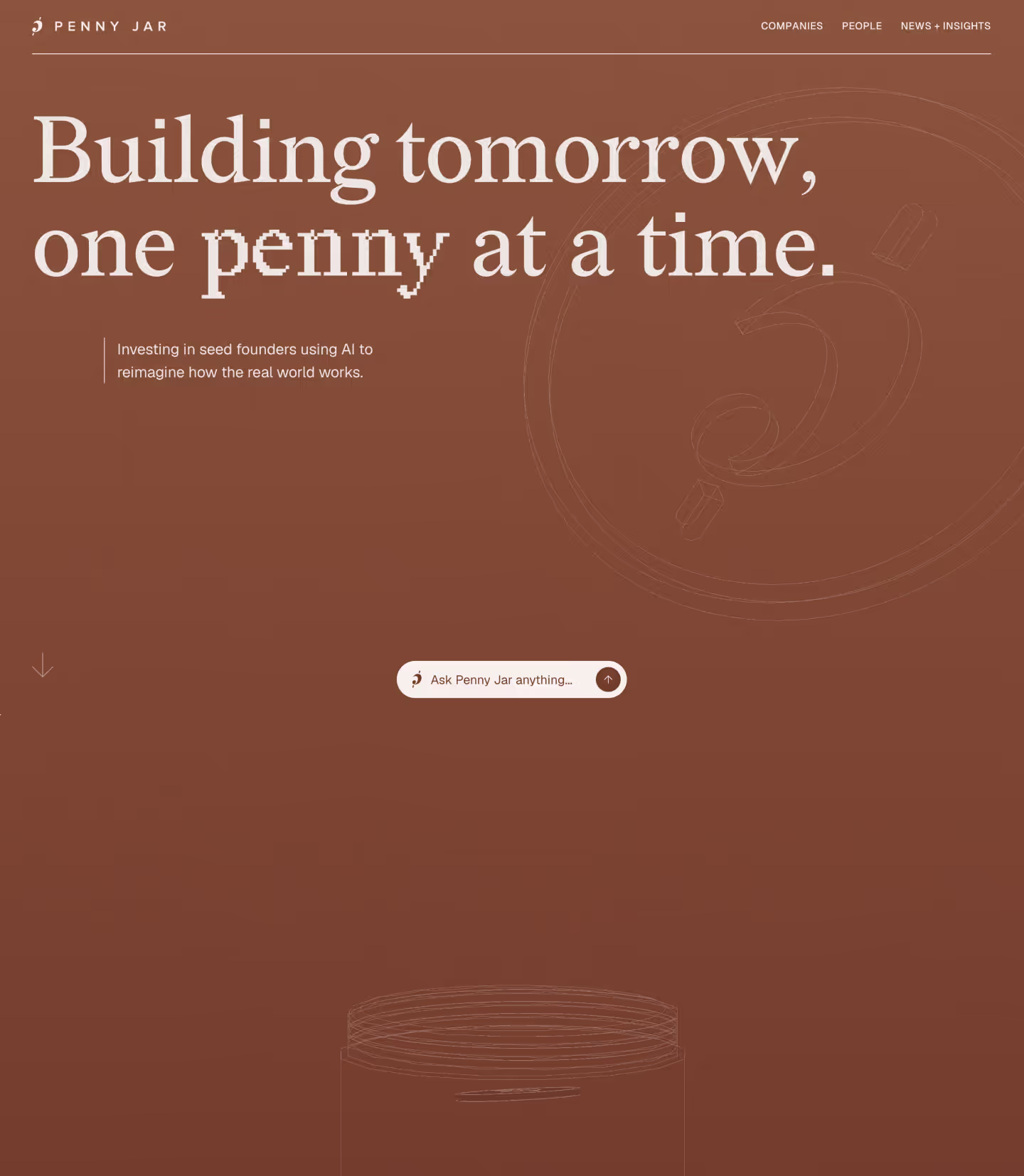
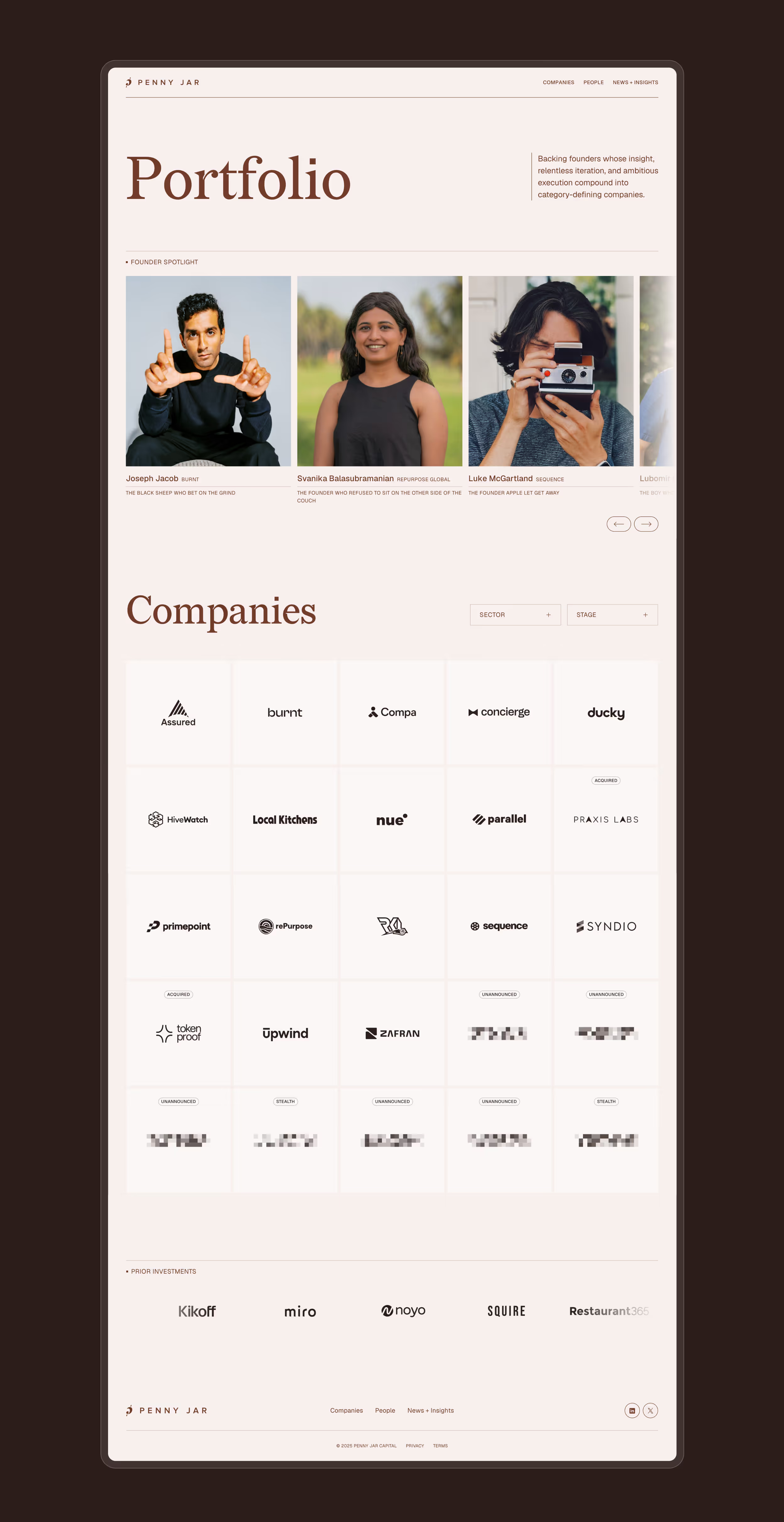
Penny Jar Capital
Immersive website for a VC that prioritizes AI-powered interactions over traditional, content-heavy pages
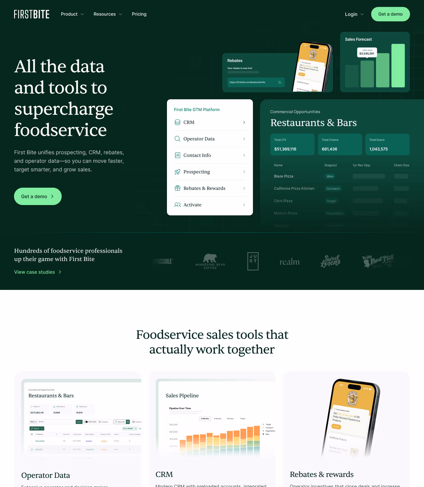
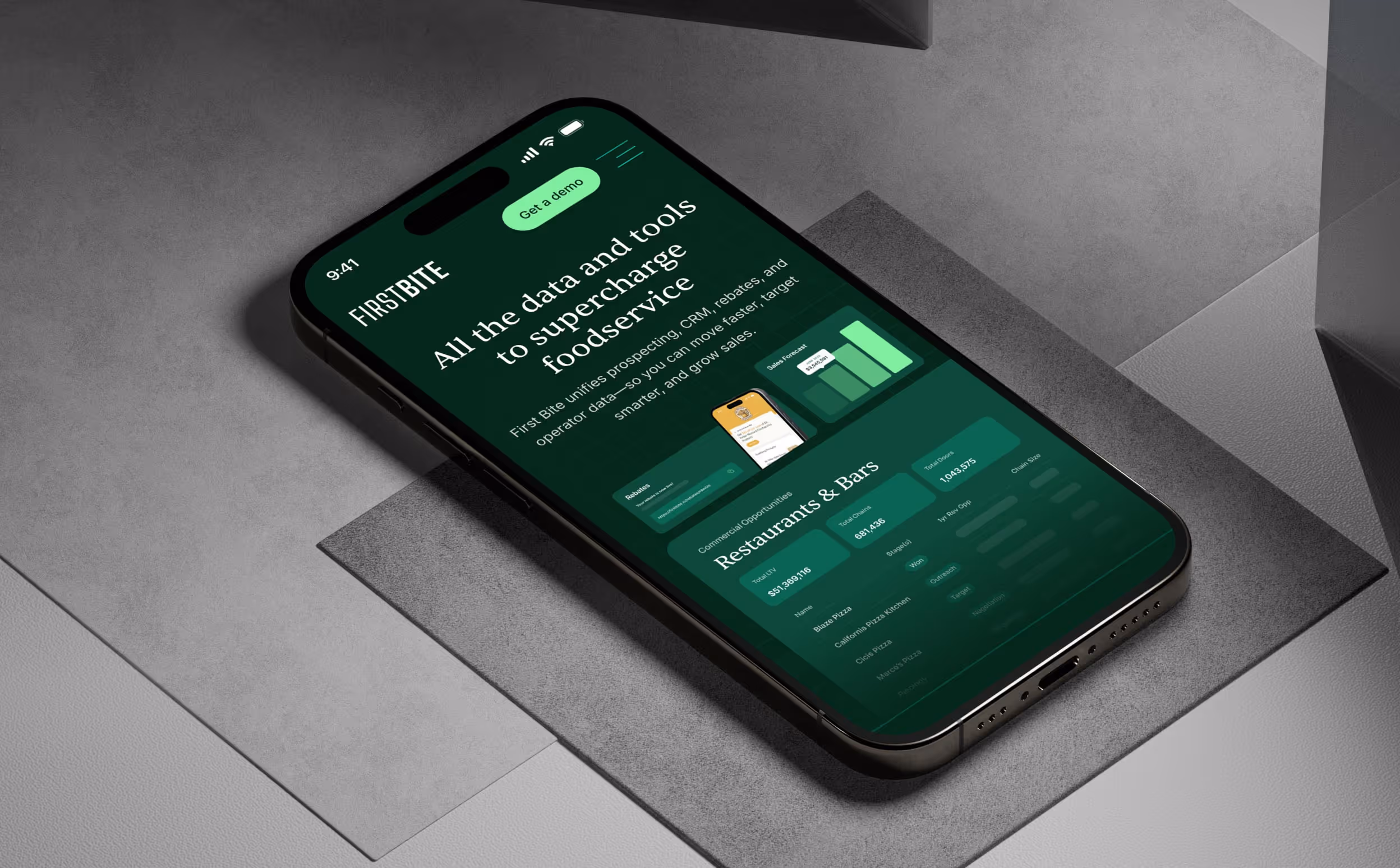
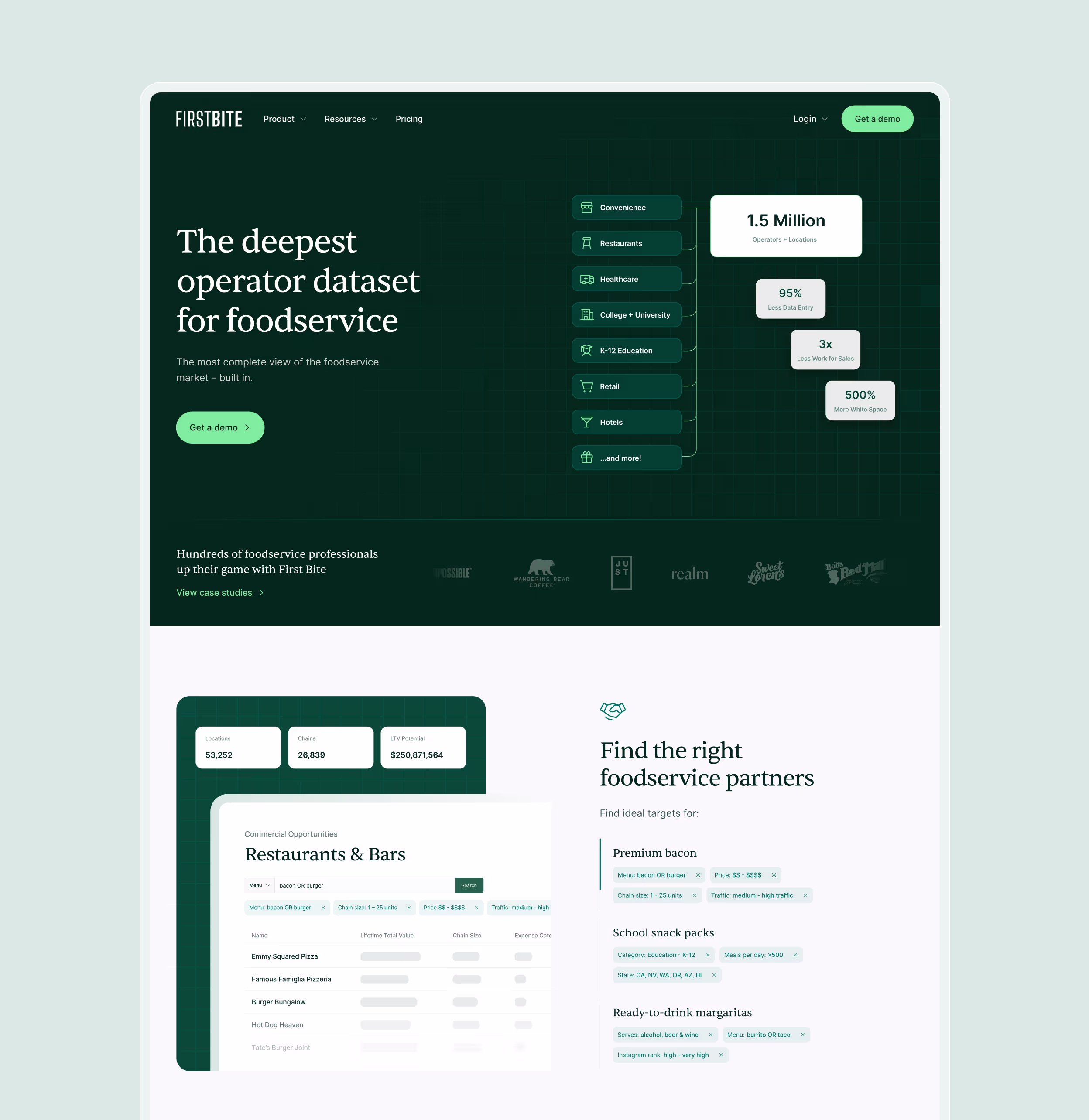
First Bite
Credible, conversion-focused website for a B2B foodservice platform targeting enterprise accounts
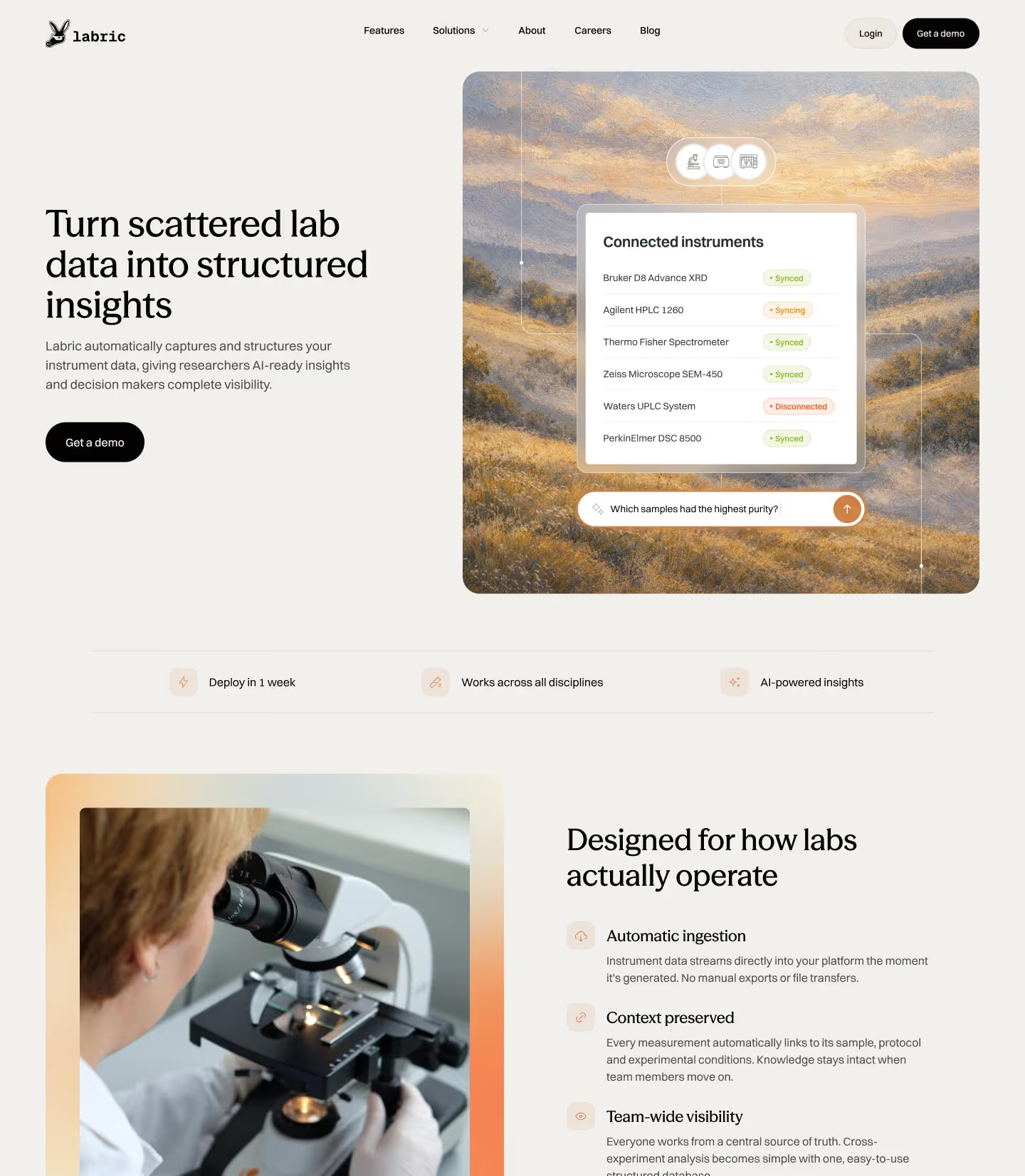
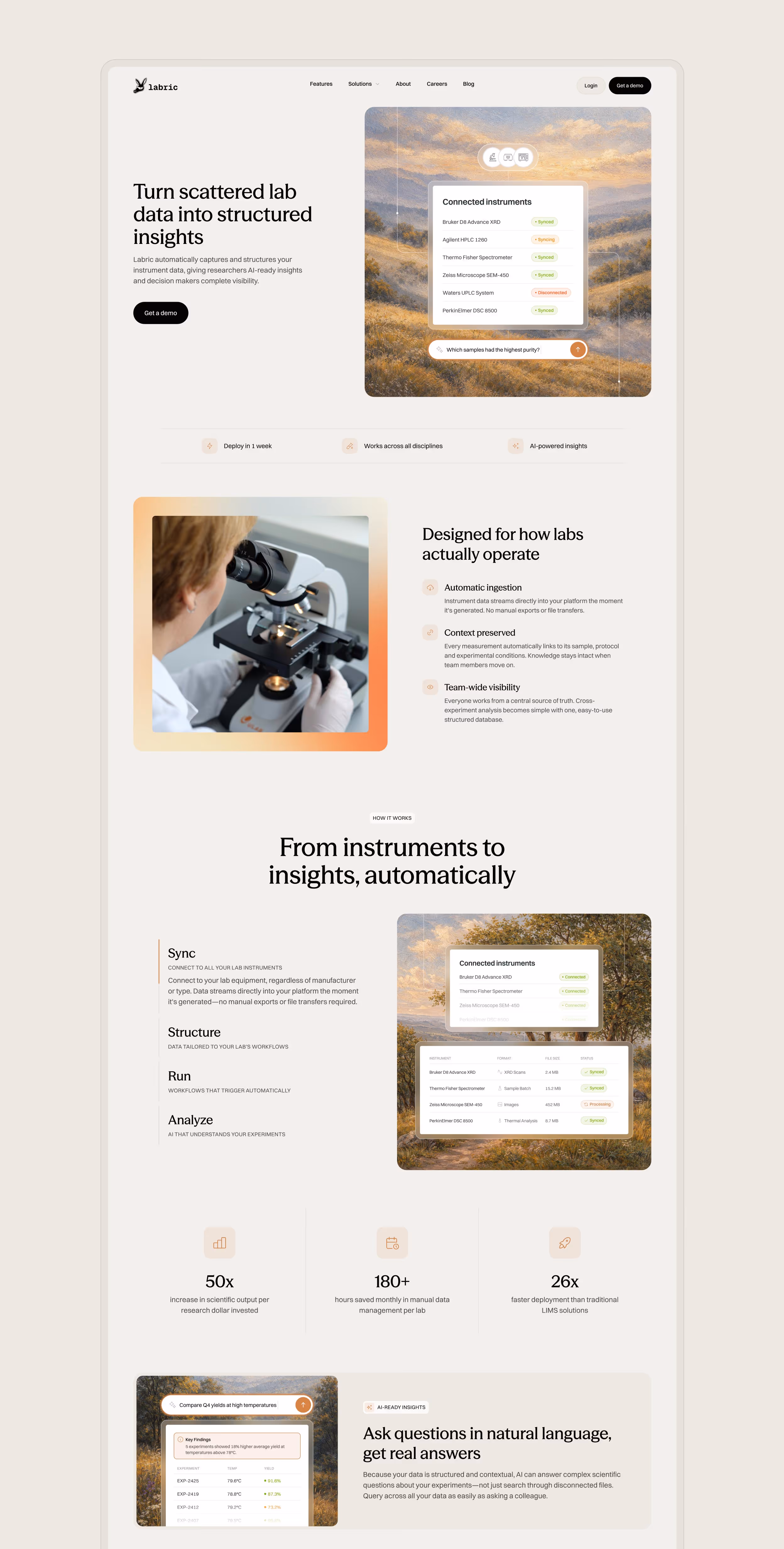
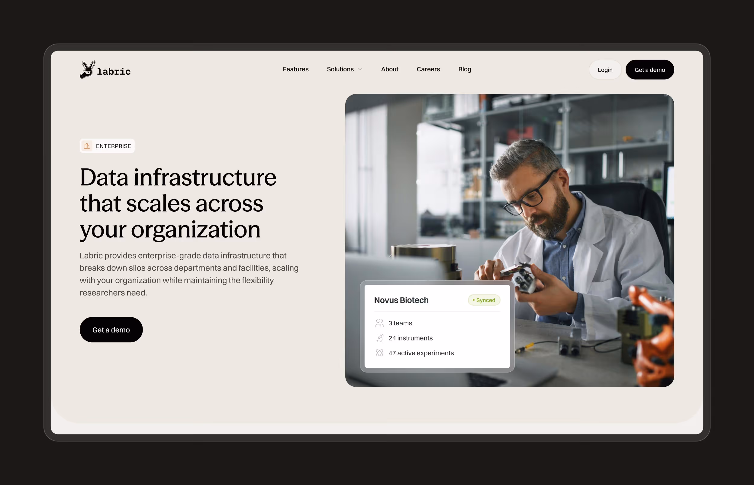
Labric
Building credibility with academic and enterprise buyers to help shorten a complex sales cycle
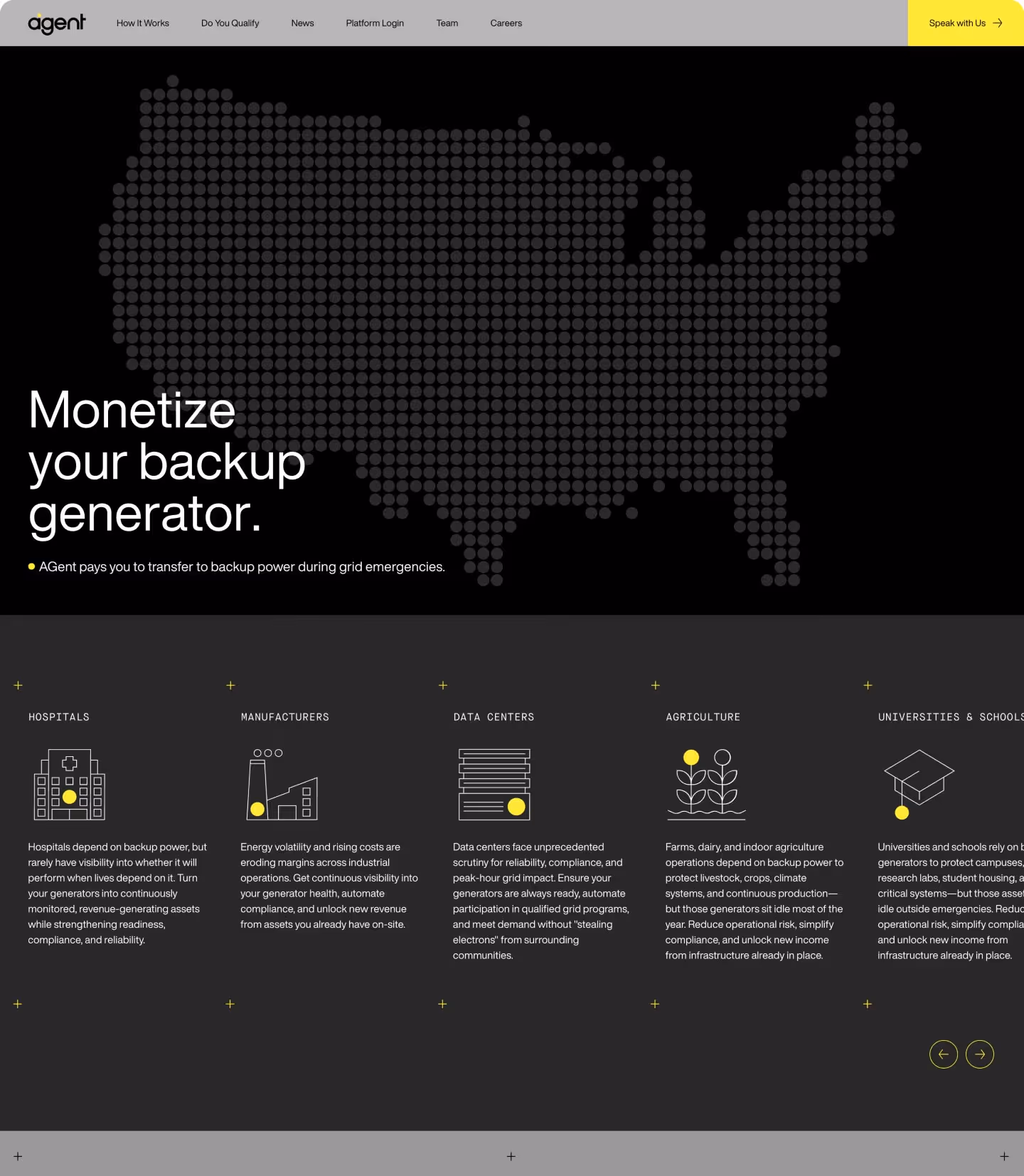
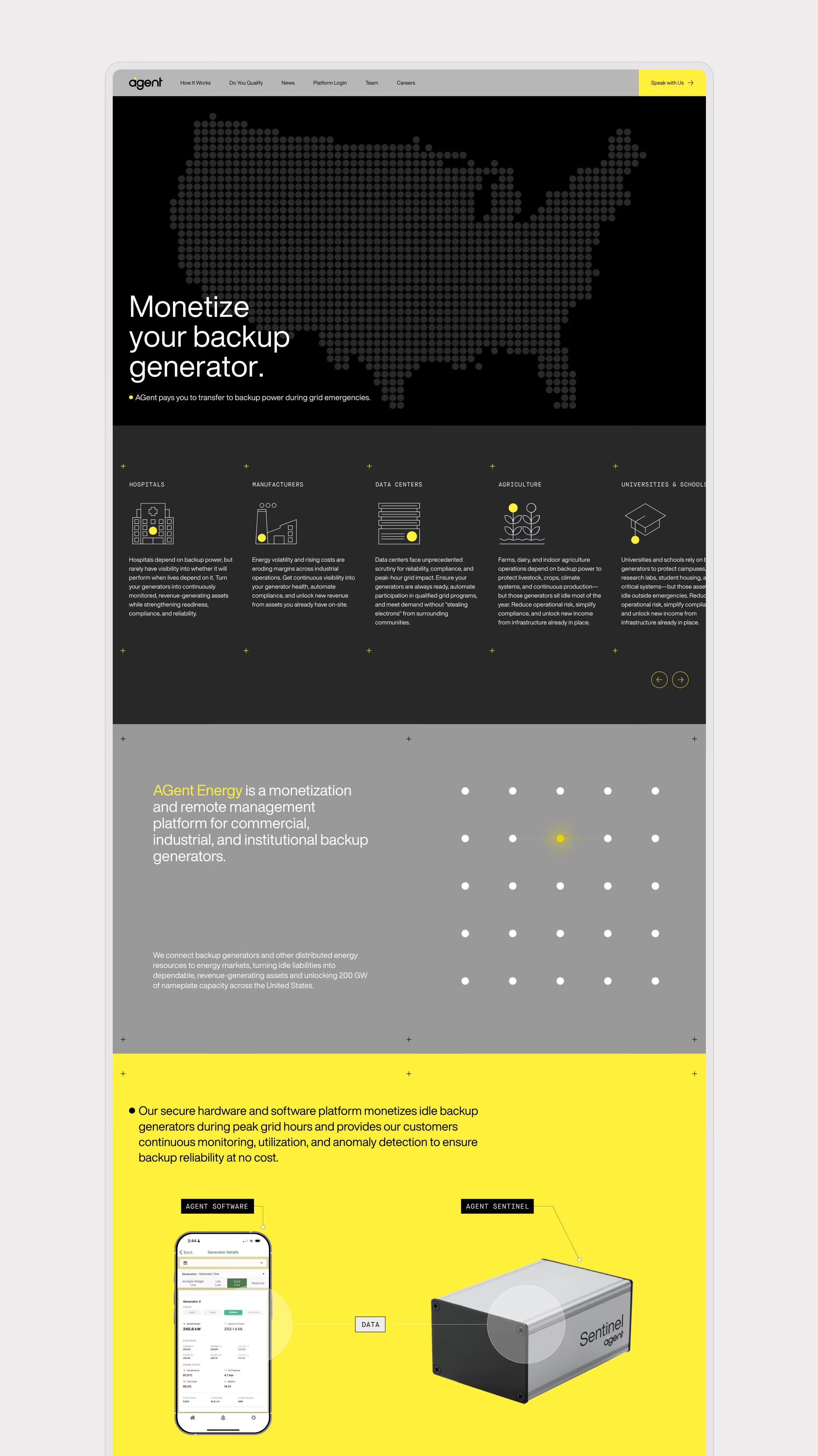
AGent Energy
Launching a complex Webflow website in one week to unblock a critical go-to-market push
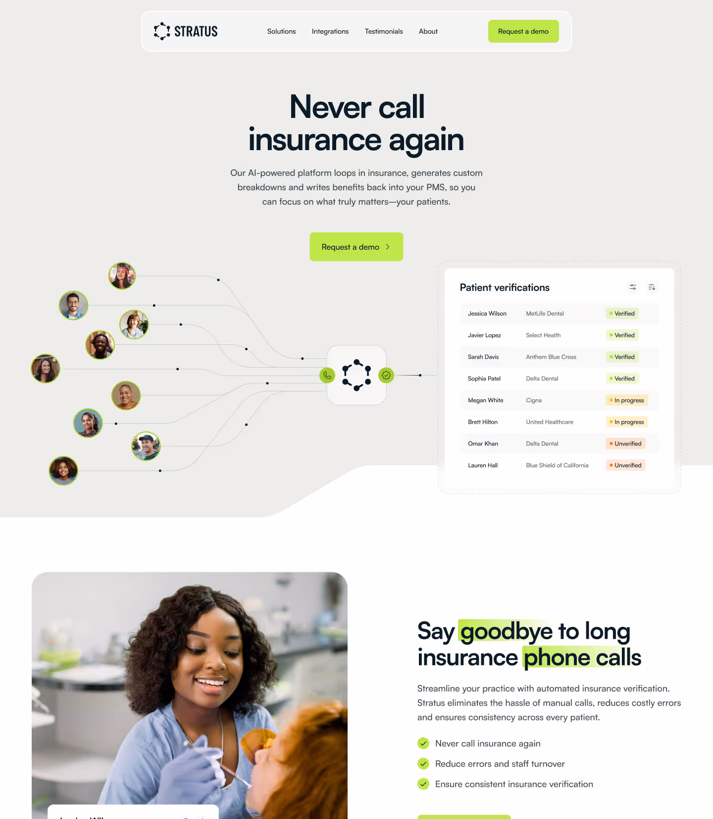
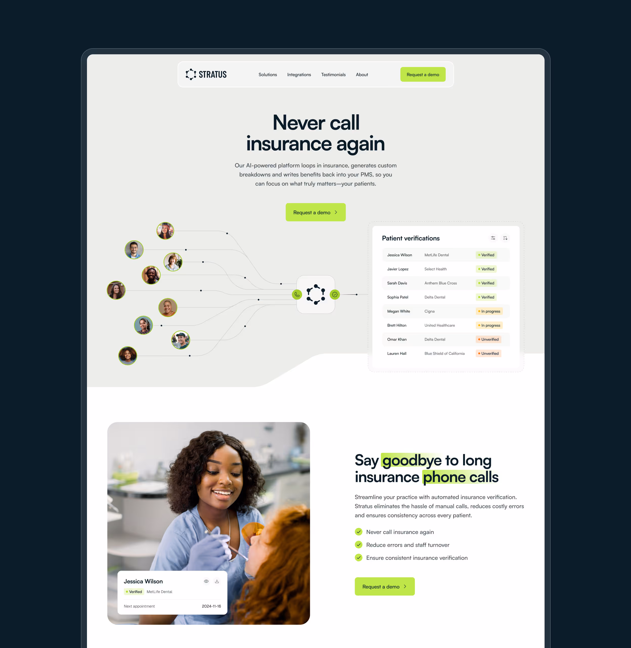
Stratus
Streamlined Webflow site enabling a $600k ARR insurance tech startup to generate qualified online leads
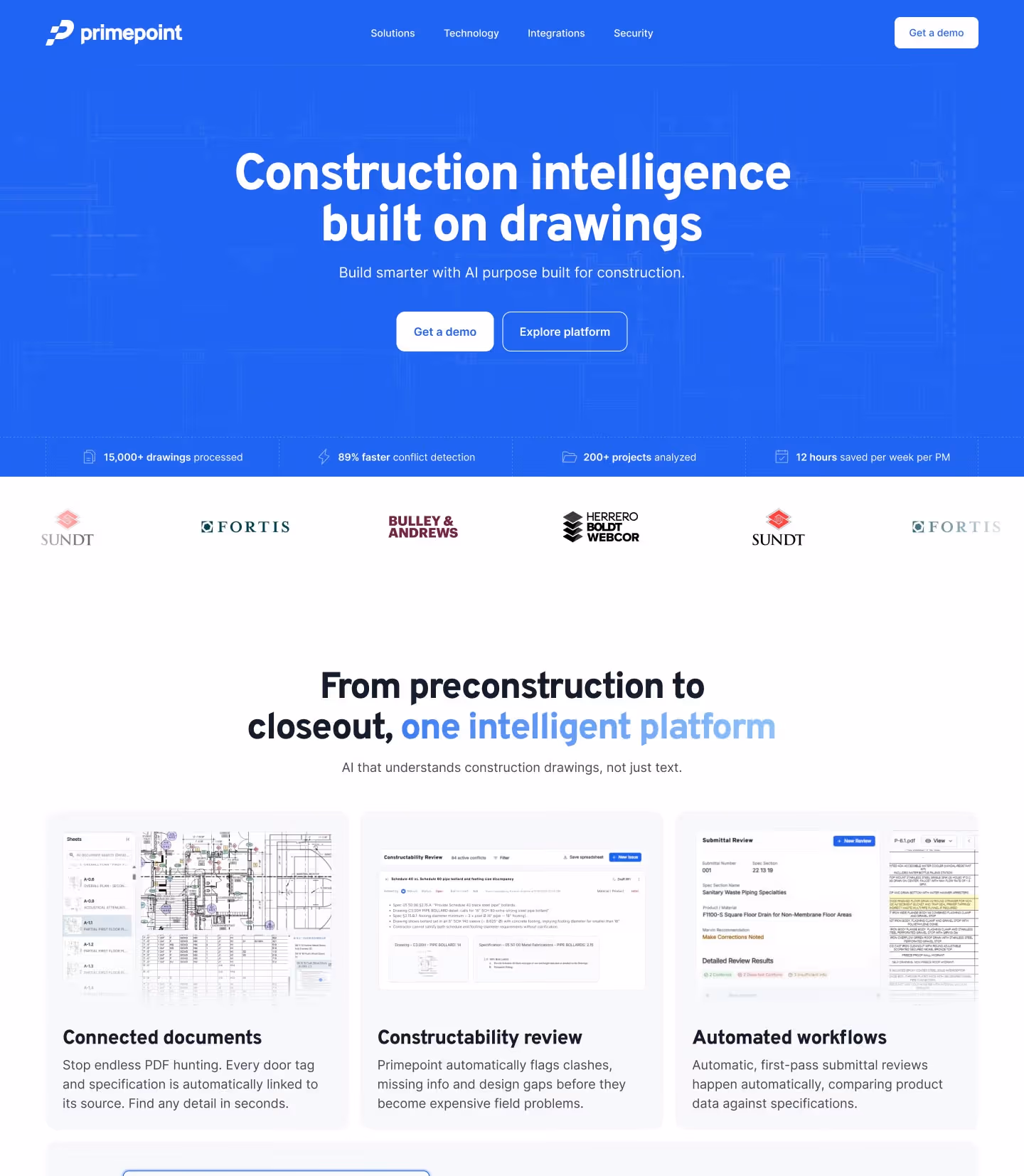
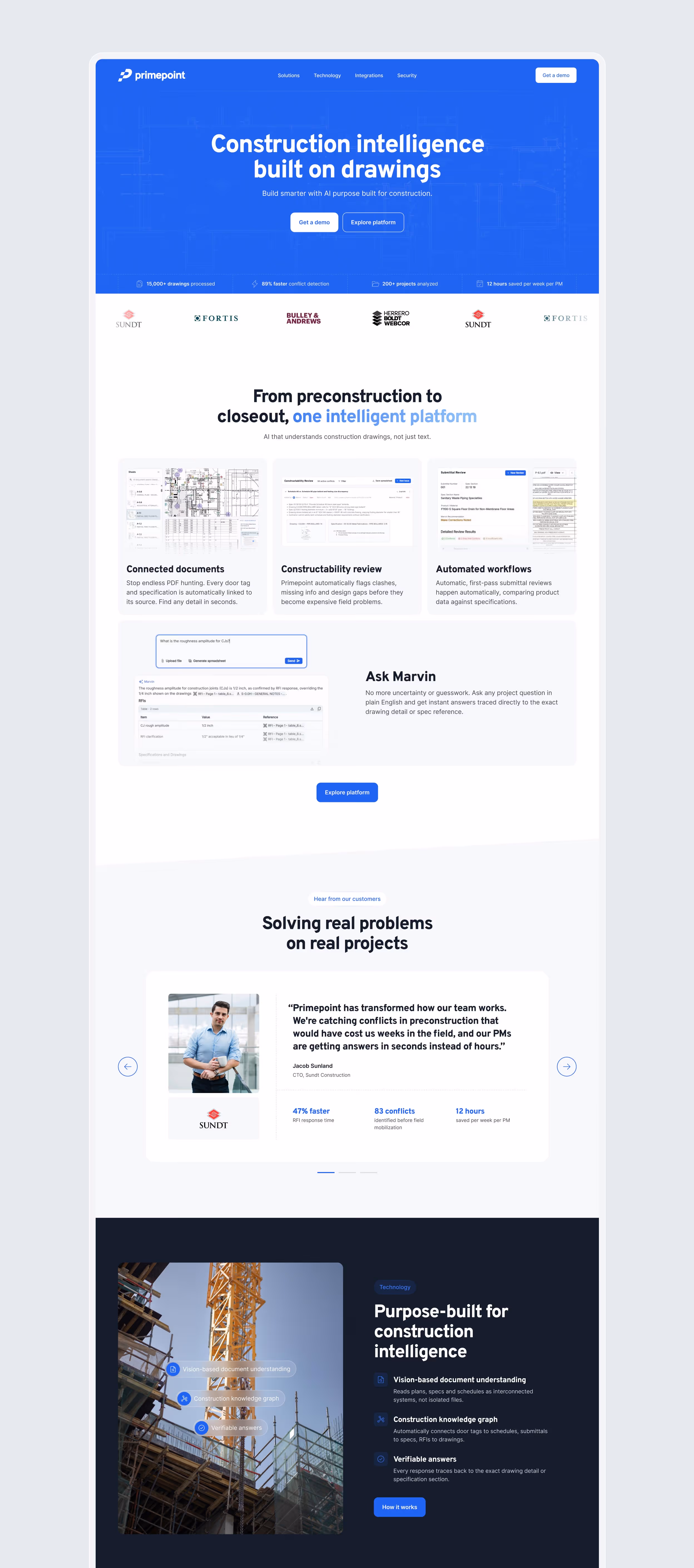
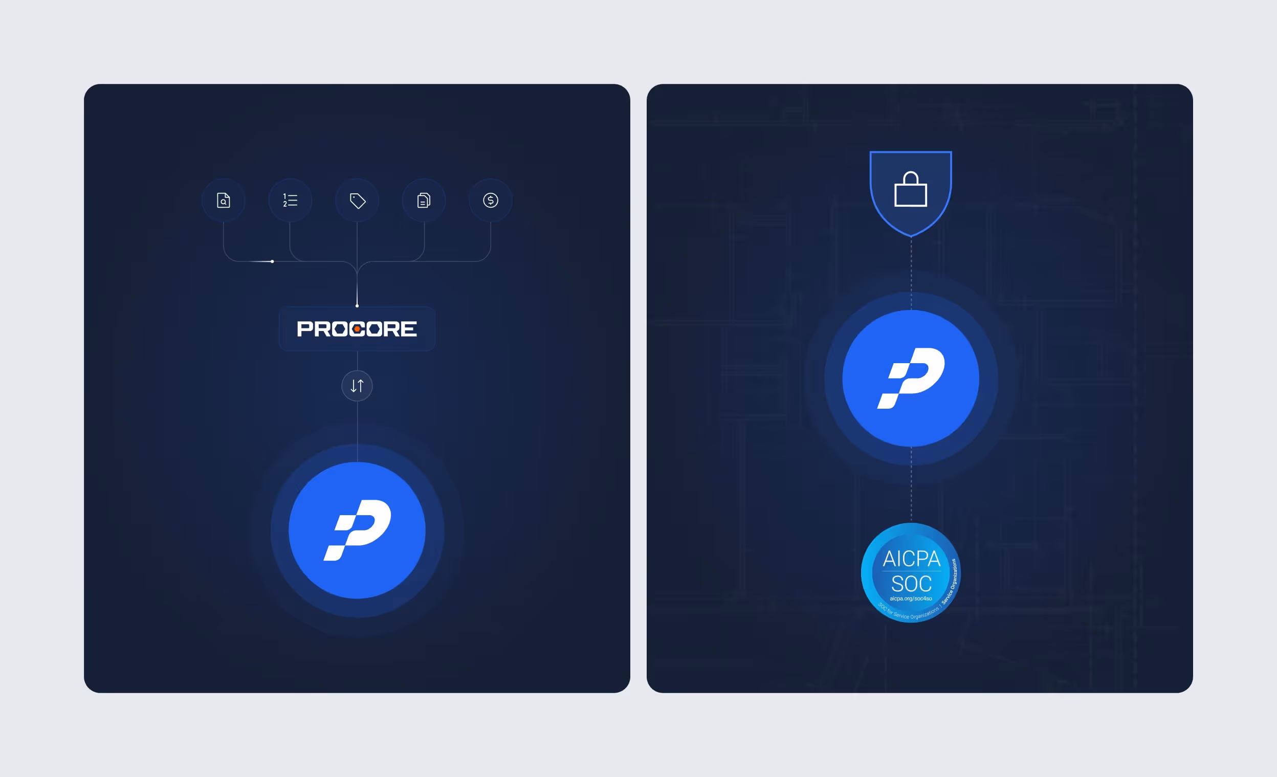
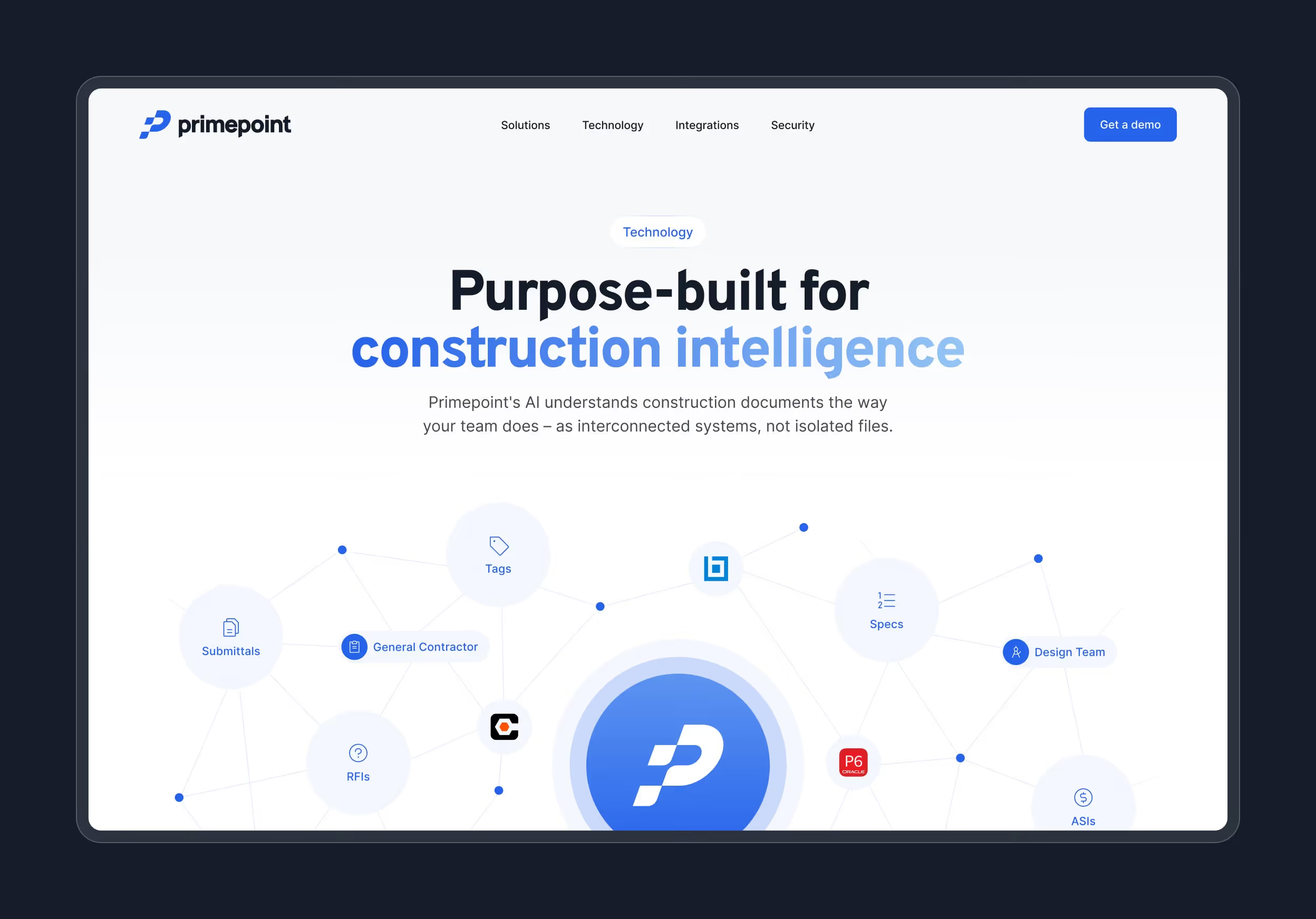
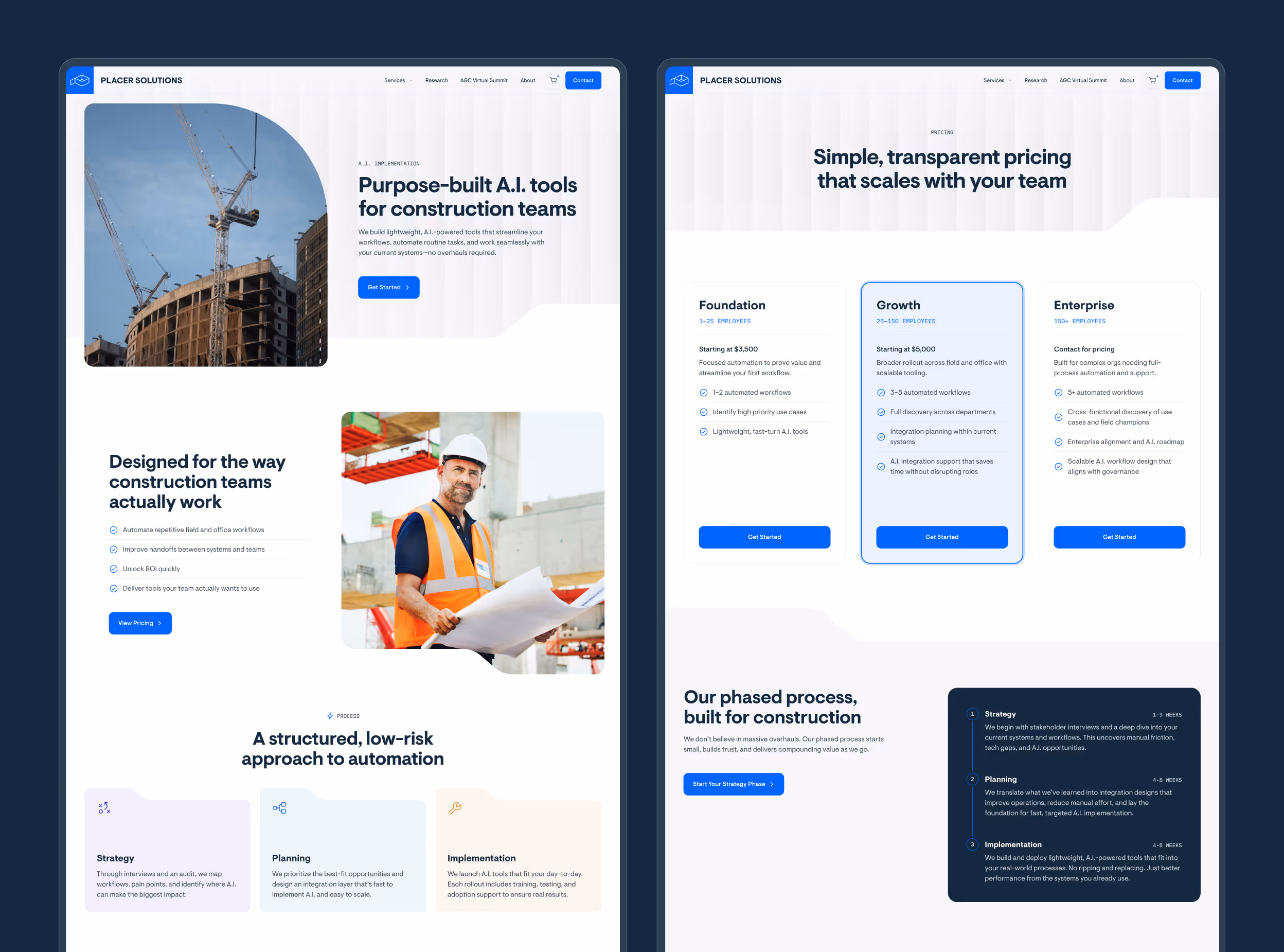
Primepoint
Building an enterprise-ready website to support a growing sales motion in construction intelligence

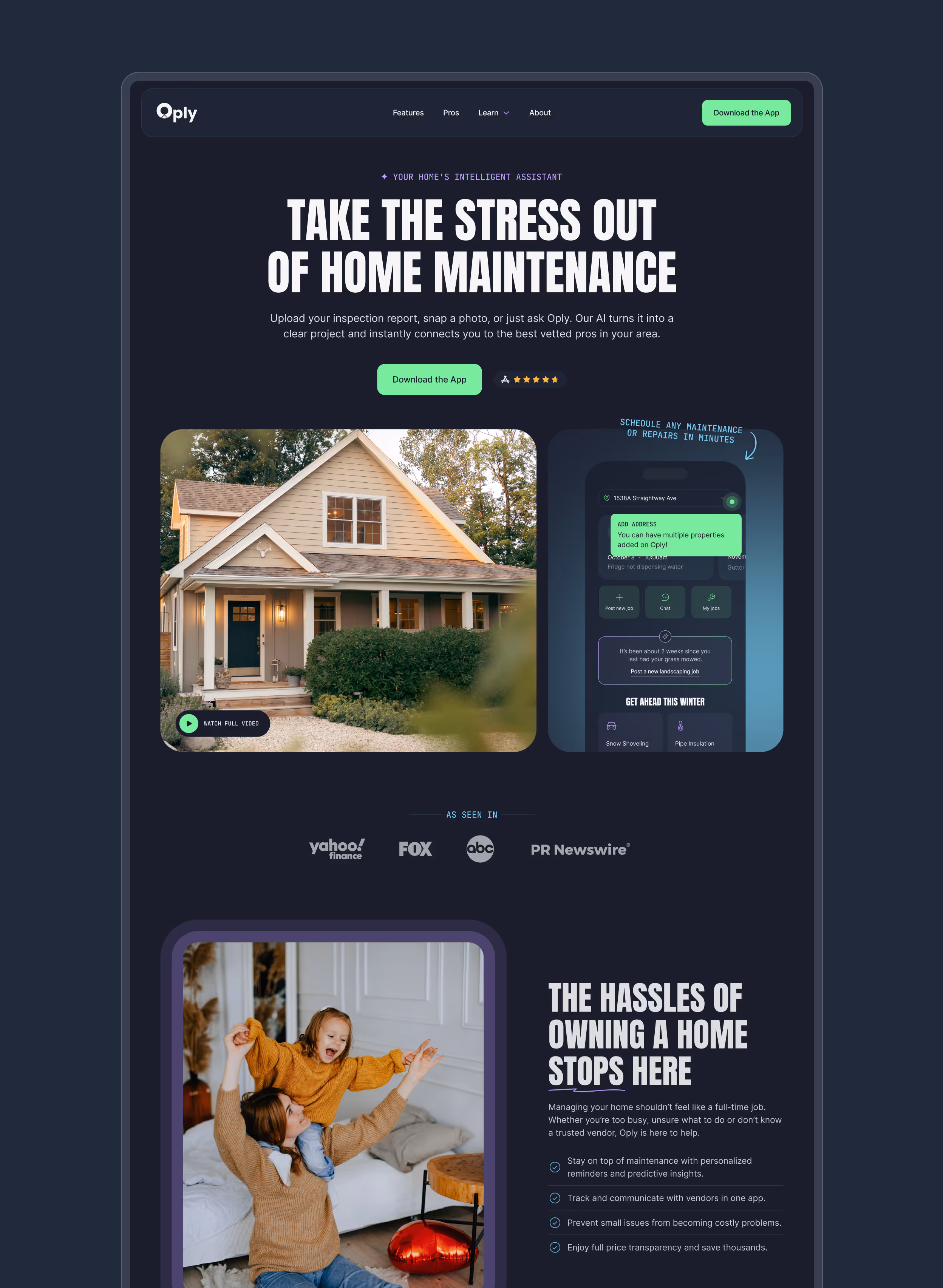
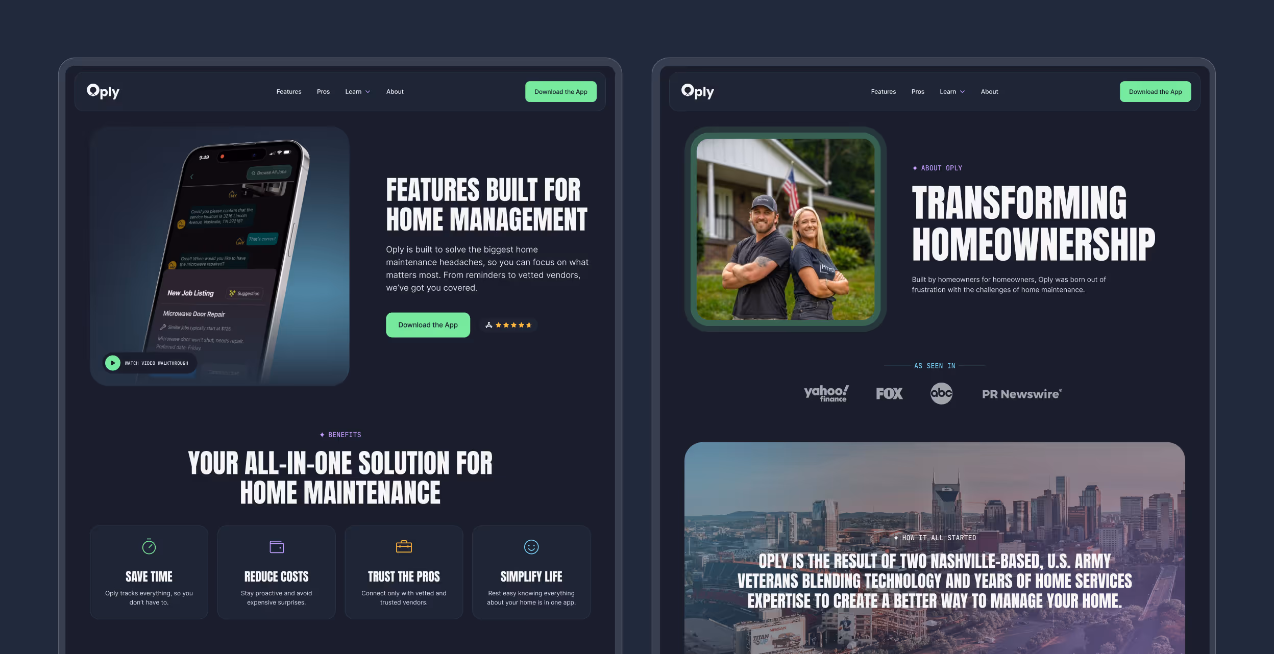
Oply
Bold, quirky website driving 35% more conversions for an AI-powered home maintenance mobile app
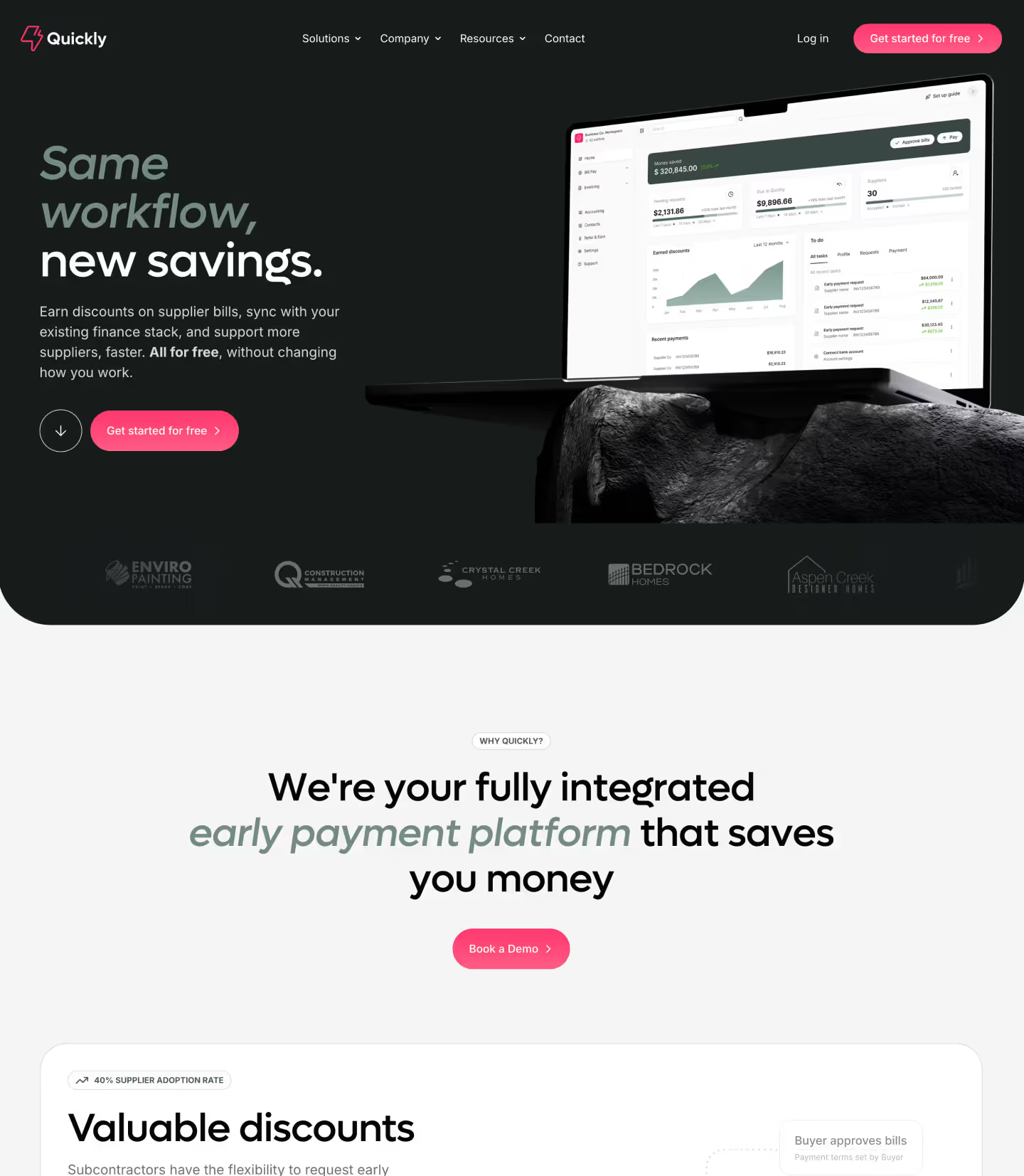
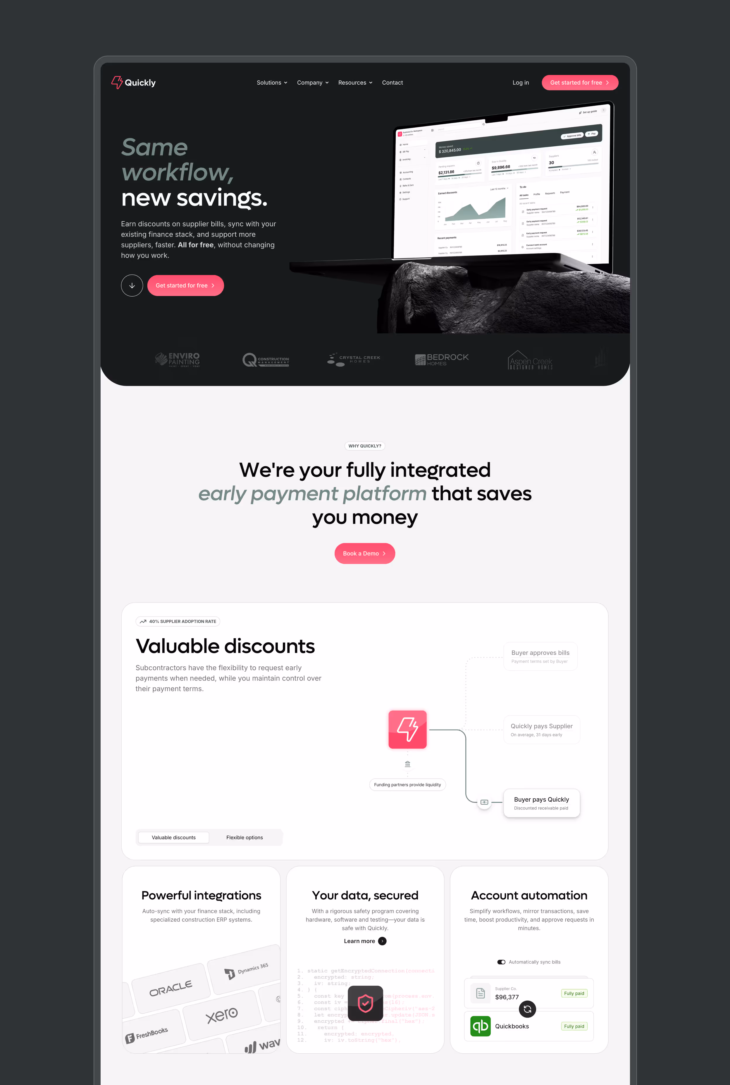
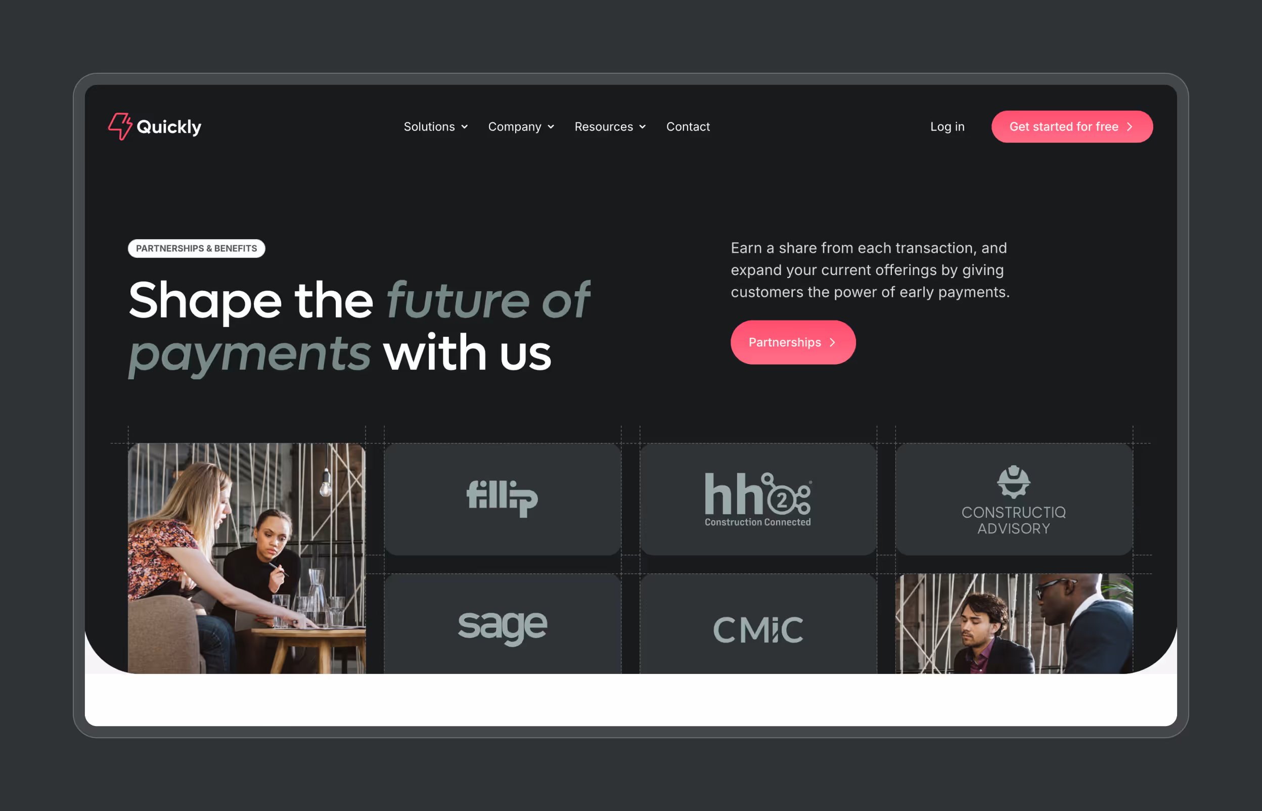
Quickly
Scalable, enterprise-ready Webflow website for a high-growth, early payment fintech startup
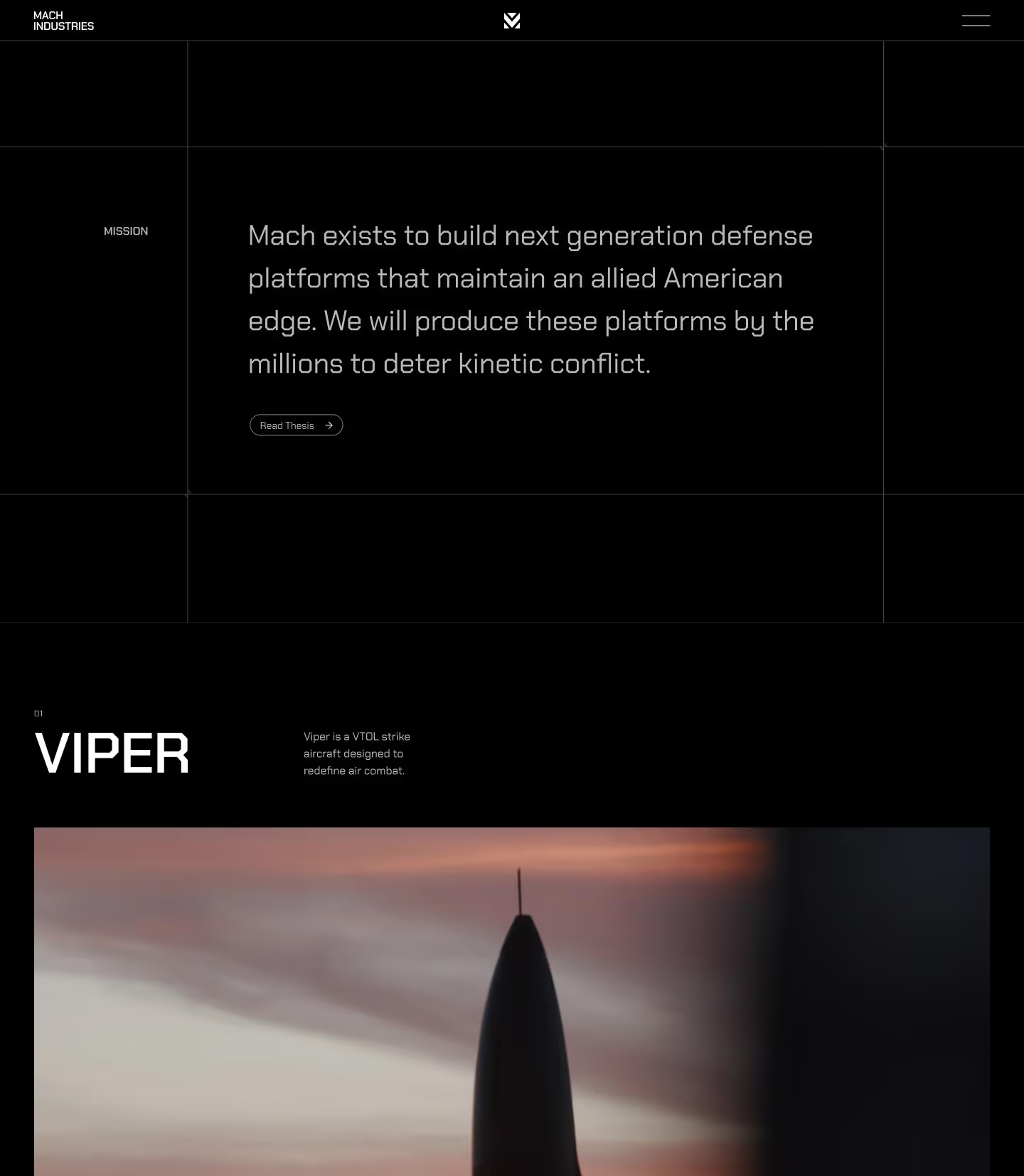
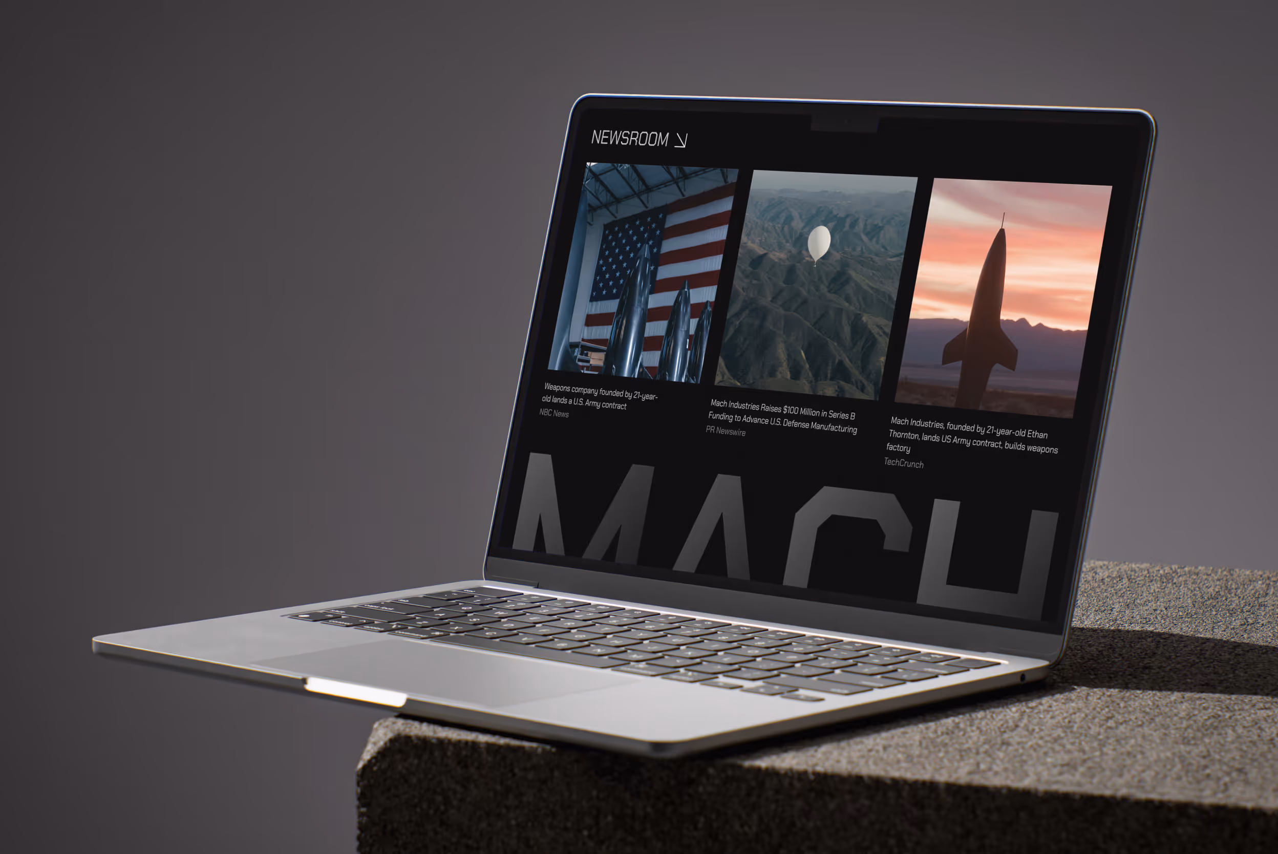
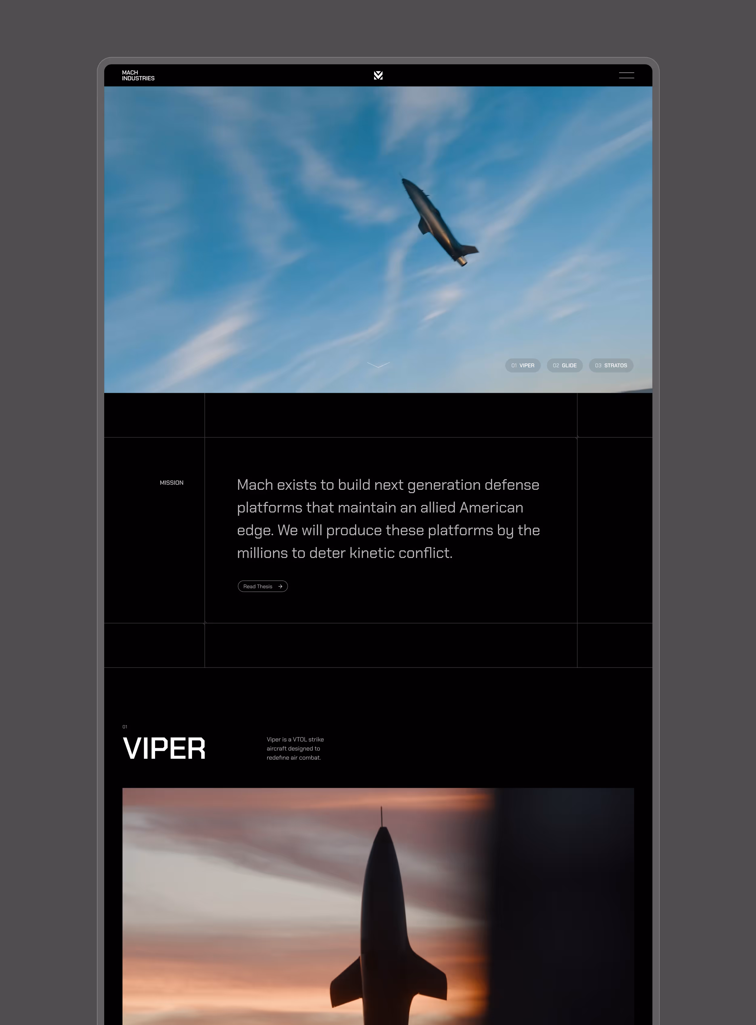
Mach Industries
Cutting-edge and immersive Webflow website for an emerging Series B defense manufacturer

Webflow websites for startups
Launch an effective, standout Webflow site in weeks, not months

FAQ
Your Webflow questions answered
Webflow offers the speed and flexibility modern startups need. I can deliver complex, pixel-perfect sites in weeks, not months.
After launch, you’ll be able to easily add, edit or remove content quickly with the powerful Webflow CMS and page builder template – no dev team required. Learn more about my Webflow process.
A small to medium site typically takes about 2–8 weeks from kickoff to launch. Webflow’s low-code approach helps me move fast while still crafting a standout, fully responsive site.
Project investment starts at $10,000, with most builds ranging from $15,000-$25,000 depending on scope and complexity. Every project includes custom design, advanced animations, conversion optimization and a flexible CMS that your team can update independently. We'll discuss your specific needs during a discovery call and I'll provide a tailored proposal. Ready to get started? Let’s talk.
Absolutely! My maintenance plan gives you a monthly bank of hours for updates, new pages or any tweaks you need – keeping your site fresh and highly-optimized without the overhead of a full-time dev.
Discovery
I’ll send you a short questionnaire to gather your goals, success metrics and design preferences. After that, we’ll hop on a 30-minute call to review your responses and dive deeper. By the end, I’ll have everything I need to set the stage for a successful project.
Design
With clear objectives in mind, I get straight into shaping the website’s look and feel. I present 2–3 design concepts so it’s easy to see which resonates most. Once we finalize the direction, I move on to designing the homepage and any necessary internal pages.
Develop
My Webflow process is built around reusable components, ensuring consistent design across your site and giving you the freedom to make big updates—or even create new pages—all on your own. Once everything is thoroughly tested, I add finishing touches like SEO and performance optimizations.
Deliver
When your domain and hosting are set, launching is just a click away. I’ll then share a few quick Loom videos to walk you through site management, so you can edit and update with ease.
Sounds good? Let’s get started on your Webflow project.